The Innamincka Affair: Love. Lies. Mortal Danger. A lot can happen with an affair at Innamincka. Rebecca Boucher is a respected junior partner in a London law firm. When she’s sent to Australia to meet with the owner of a vast cattle property, she’s expecting a straightforward legal matter. But what she finds is Cooper Read More ...
Marriage in a Cold Climate View it on the UK Amazon Store The stark beauty of the frozen wastes of Siberia, where the cold can snap steel rails, and the empty sweep of the tundra, alternately a snow-muffled wasteland and an unexpectedly safe trackside haven, are vividly evoked. Against this backdrop, Robert Chalmers weaves an Read More ...
The Dragons of Sara Sara Innocence and terror meet in a fast-paced evocation of a time far in the future. Set among momentous happenings, Robert Chalmers catches a society on the brink of a new age. View it on the UK Amazon Store In an age far ahead in time, two young people from very Read More ...
Typography tools have the ability to transform ordinary text into jaw-dropping typography.
Let’s talk more about leading (or line spacing), and how you can apply it in your own design work.
Here’s What You Need To Know.
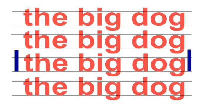
The definition of leading is the distance between two baselines of lines of type. The word ‘leading’ originates from the strips of lead hand-typesetters used to use to space outlines of text evenly. The word leading has stuck, but essentially it’s a typographer’s term for line spacing. So, think Line Spacing, think Leading. (As in Bedding)
Why Document Designers Use Leading?
Leading can make your text look instantly better. It’s one of the quickest and simplest tweaks you can do. Remember, Leading is much more than just simple typewriter Line spacing.
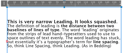
If you’re working in design software like Affinity Publisher or Affinity Designer, the program will set a default leading value that covers the entire paragraph or document. This is not usually generous enough and can make paragraphs look squashed. This works less well for most documents. Your readers want to be able to read the text after all. The above text is set in 16pt, and the leading is 16pt. Not ideal. It needs to be more generous and this is where the standard of 120% to 145% override of the font point type comes in. More on this in a moment.
Increasing the leading allows the text to breathe and makes it appear instantly more attractive. For readers it has practical advantages too—increasing leading makes text easier to read, especially over longer periods of reading.
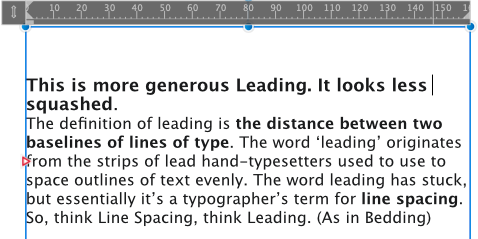
Increasing your leading will ensure your audience is reading for longer. The above paragraph has the leading set to 19.2, which is 120% of the font point size of 16pt. The heading is actually 18pt, but in this case, it’s ok.
How To Apply Leading in Affinity Publisher?
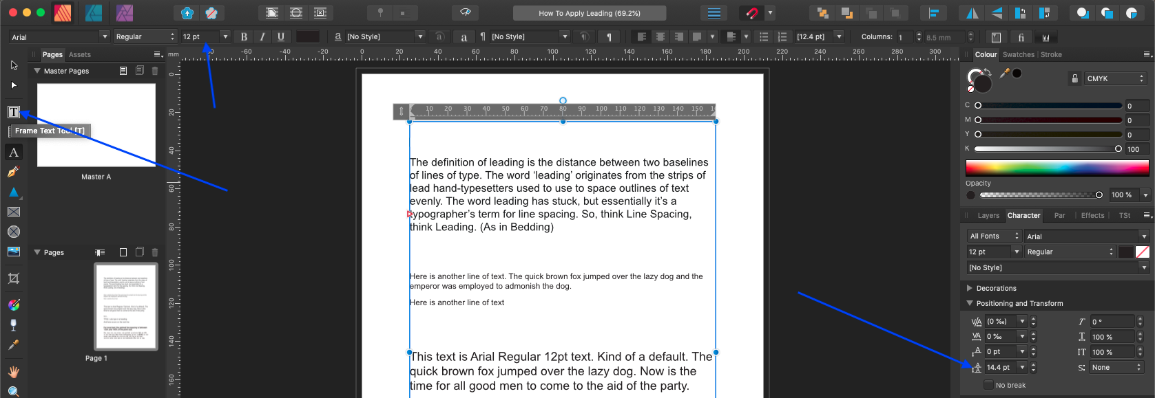
When working in Publisher, once you’ve created a piece of text using the Frame Text Tool [T] or the Artistic Text Tool [T], you can adjust the leading from the Character panel (Positioning and Transform) in the right-side navigation panels. To edit the leading across a whole section of the text, either highlight the text or click on the text frame to select it.
Click Image to Enlarge It
Leading is positioned in the Positioning and Transform panel on the right column. Not the Typography panel. Setting the leading to Auto will apply Publisher’s default leading for the font size you currently have applied. You should see this as a minimum value for your leading. Increasing the leading (which is measured in points, pt) will increase the line-spacing across your paragraph. Affinity Publisher has a long list of preset leading values you can choose from in the dropdown menu, and you will see the spacing change as you scroll up and down that list. If you can’t help thinking in Line Spacing – then the font size times 120% is about a standard single line spacing. If you aren’t happy with the defaults or you really need to tweak your text, use the multiplication rule. Leading is 120% to 145% of your font point size. So 12pt Arial Font has a leading of 12 x 120% or 12×1.2 which equals 14.4pt.
Creating a Stand Out Heading in a paragraph.
To apply a particular leading value to just one line of text (e.g. if you want to separate a paragraph visually from a heading positioned above), highlight the line you want to shift downwards and increase the leading. This is much more accurate than just pressing the Enter key… In the sample above, I increased the first line leading to 30pt, while the rest of the paragraph stays at 14.4pt
Advanced…
Leading may seem straight forward but you need to have a firm understanding of it for making the most of this simple type technique.
While generous leading can improve the look of paragraphs, making the leading overly generous can disrupt the flow of the text and impact on legibility. Make sure you can read the text comfortably before sending to print.
If you are setting text against a coloured or dark background Apply slightly more generous leading than normal to make the text ultra-clear to read.
Different fonts and different font sizes will suit different leading settings, as the x-height (the height of lowercase letters) will vary between fonts.
Fonts with shorter x-heights won’t require as much leading as those with taller lowercase letters.
Watch for my guides to Kerning and Tracking coming up soon. You will also find them when ready on my YouTube Channel. If you Subscribe to the channel, you will automatically receive notifications when I upload new material.