The Innamincka Affair: Love. Lies. Mortal Danger. A lot can happen with an affair at Innamincka. Rebecca Boucher is a respected junior partner in a London law firm. When she’s sent to Australia to meet with the owner of a vast cattle property, she’s expecting a straightforward legal matter. But what she finds is Cooper Read More ...
Marriage in a Cold Climate View it on the UK Amazon Store The stark beauty of the frozen wastes of Siberia, where the cold can snap steel rails, and the empty sweep of the tundra, alternately a snow-muffled wasteland and an unexpectedly safe trackside haven, are vividly evoked. Against this backdrop, Robert Chalmers weaves an Read More ...
The Dragons of Sara Sara Innocence and terror meet in a fast-paced evocation of a time far in the future. Set among momentous happenings, Robert Chalmers catches a society on the brink of a new age. View it on the UK Amazon Store In an age far ahead in time, two young people from very Read More ...
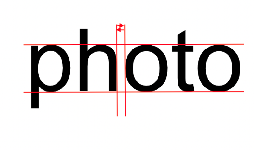
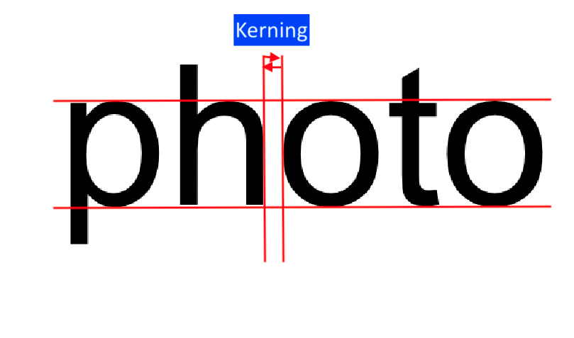
Kerning is the process of increasing or decreasing the space between individual characters, thus adjusting the position of letters in relation to others.
It’s commonly used on prominent pieces of text, such as headlines and logos and titles. Not to be confused with tracking.
Why Use Kerning?
Although the process of tweaking kerning may be very subtle, it can have significant effects on presentation.
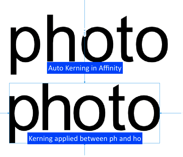
Kerning is applied to letters to improve the overall symmetry of a word or phrase, which the default tracking settings provided in the font file may not be able to achieve alone.
As well as having an instant beautifying effect on text, kerning can also have an effect on the readability of the text.
A note of caution! There are many infamous examples on the web of kerning gone wrong, when poorly kerned letters have formed unintended or, in some cases, downright rude, words.
How Do I Apply Kerning?
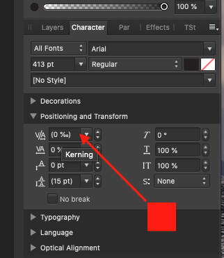
In Affinity, you can adjust kerning from the Character panel.
Select the Type Tool (T), click your cursor to the left or right side of a letter, and increase or decrease the kerning (which is measured in percentages of the font size again) by choosing from the default options or typing in a number. Positive for larger spacing. Negative to reduce spacing.
kerning of 150% applied between all letters except space
Look Like A Professional
Keep your text looking as professional as possible.
Certain letters require more kerning attention than others. Slanted letters like W, V, K and A tend to sit too far away from other letters when kept to their default spacing. Letters with arms or large serifs, such as T, L and K may suffer from the opposite problem, tending to sit too close to other letters, creating an overcrowded effect. So make sure to comb your designs for these problem letters.
Flipping your text upside down before you apply to kern is an age-old tip beloved of typographers. This allows you to asses the spacing between letters on a purely visual level, without being distracted by the meaning of the word. It’s an eccentric tip that works surprisingly well.
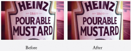
Tip: It’s ok to have letters crash into each other to create correct letter spacing. The R and A in pourable need to touch due to the negative space created by the slant of the A. The B had to move to the left slightly too to close-up the white space.
If I had to just kern one thing on any piece of creative, I’d spend extra time with your headline—especially if your layout is type and/or copy driven. Because when your all-type headline layout looks good, it is your visual. Treat it that way.
Don’t forget to check out my YouTube channel, where you will find lots of Affinity tutorials and short HowTos. If you subscribe and tap the bell, you will be notified any time that I pop up a new YouTube Video.